Designing a Book Cover
They say never judge a book by its cover… but let’s be honest, we all do it. And so do your readers! So, it’s important to make sure your book’s cover is something that not only stands out but really invites readers into your story.
In this video I’ll walk you through how to design a book cover that will catch reader’s eyes and tell them a little bit about your book before they turn a page!
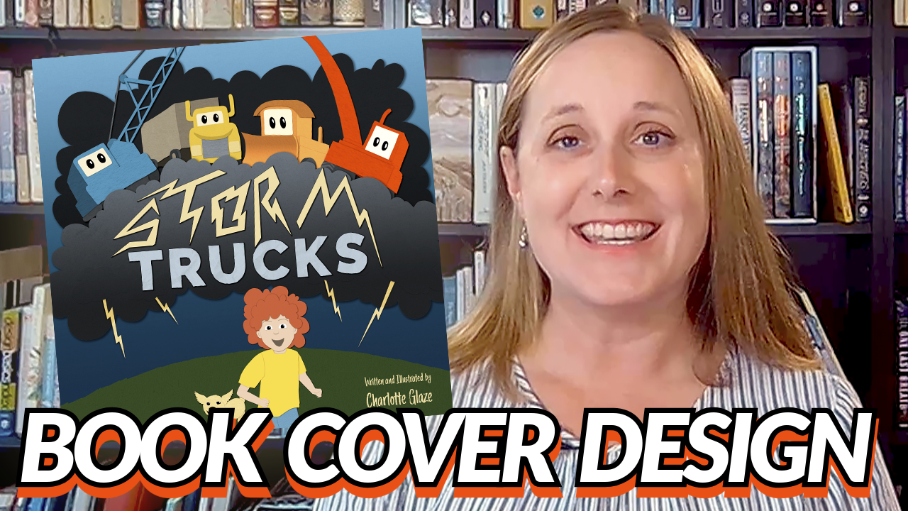
As both the author and illustrator of my book Storm Trucks, I had the chance to create the entire book from scratch, which was such a rewarding experience. Along the way, I had a few working covers, but when it was time to print, I knew that the cover needed to be just right. It’s one of the most important things to get right because it’s the first thing people will see—it’s the bait to get a reader to pick up your book and open it.
So what should you put on your book cover in order to hook readers? This is a lot like thinking of your book pitch in order to write query letters to agents, or thinking about the packaging for your favorite cereal—I bet you can picture that box, eh? Bold lettering, delicious cereal, maybe a colorful character mascot?
Examples:
Let’s look at a few of the best selling children book covers, what is on them, and how they are laid-out:
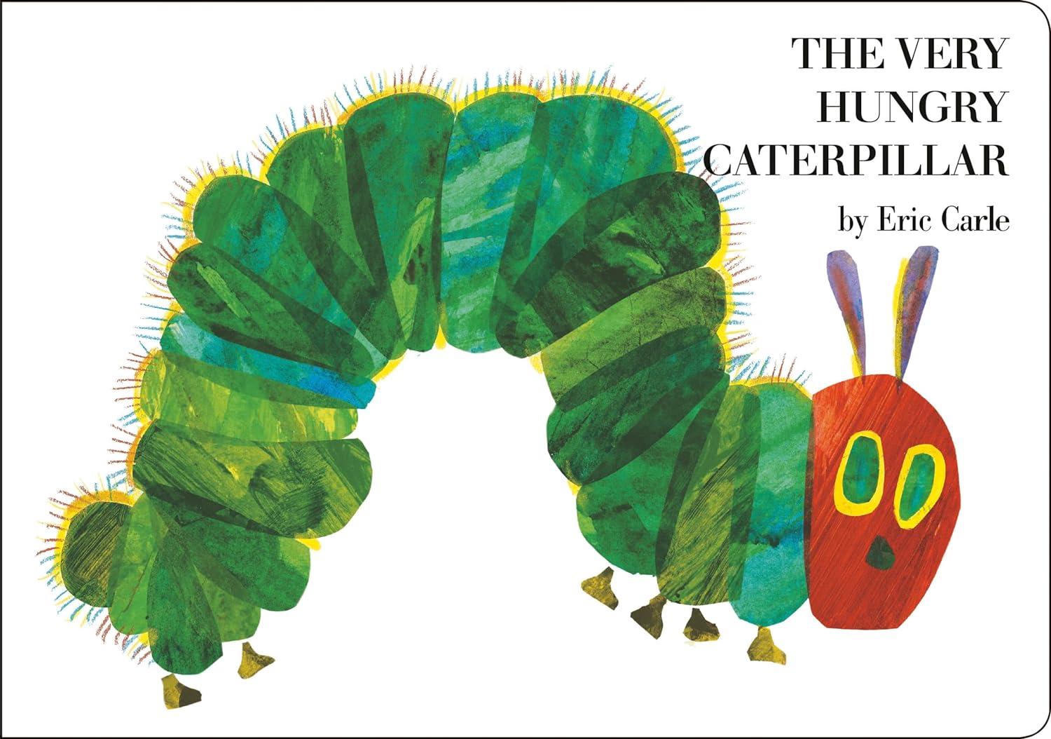

The Very Hungry Caterpillar: one bold-colored character on a white background, with large legible title and author.
Chicka Chicka Boom Boom: This one is all color. It has the title large, and the off-centered palm tree.
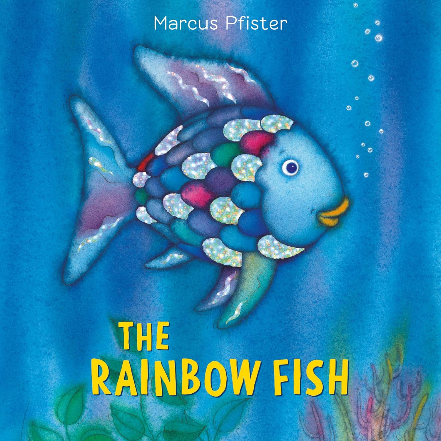
The Rainbow Fish: Here is a fish, dead center, and the eye-catching rainbow scales. The title is bright and the background is not distracting.


Are You My Mother? Solid color background. Bold title and Author name, and two characters interacting, makes sense with a question as the title.
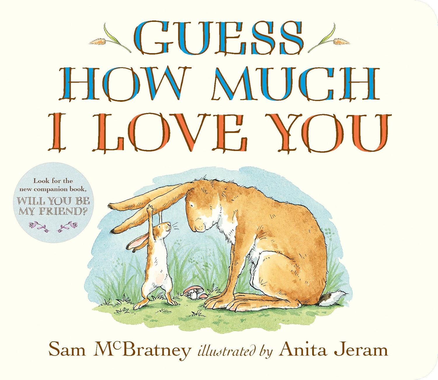
Guess How Much I Love You: Another question title, showing the two main characters centered on the cover. This tells you it’s the story of a little bunny talking to a big bunny. Title is huge, taking up half the cover.
Dragons Love Tacos: another huge title with a dragon eating a million tacos across the whole bottom. Easy to read and understand what is happening.
Tips for Cover Design
Thinking of these excellent covers, let’s talk about some tips to use on designing a cover:
Title should be clear and easy to read.
You want it to be clear and legible, even from across the room. You don’t want people squinting or saying, “Wait, what’s this book called?”
Cover should reflect the mood of the story.
Whether it’s action-packed, peaceful, playful, or funny, the vibe of your cover should give people a hint of what’s inside. Ask yourself: does it make you feel the way you want your readers to feel?
Feature the main character.
Most picture book covers highlight the main character, and often, the character is front and center, looking right at the viewer. It helps create a connection before they’ve even read a single word. Usually interior illustrations of the characters looking at the reader are a no-no, but on the cover… eye-contact is popular!
Your book should feel like it belongs.
Take a look at other books in the market to see what’s trending. You don’t want to blend in completely, but you do want your cover to fit comfortably with other books on the shelf.
Check the composition.
This one’s a bit of a graphic design tip, but even if you reduce your cover to simple shapes, it should still look balanced and appealing. One tip is to squint your eyes and see if the main shapes are still easy to read and clear.
Thumbnail Ideas
With those tips in mind, I started sketching out thumbnail ideas for my cover. I went through a lot of different options—some I loved right away, and others got thrown away.
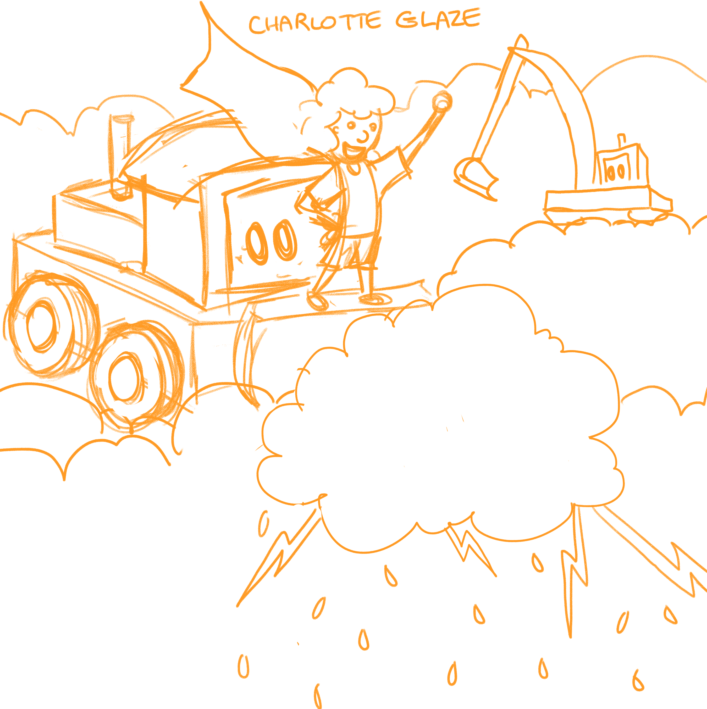
Here a peek at some of my thumbnails. My original working title was Bulldozers in the Sky—before it evolved into Storm Trucks. I wanted the cover to catch the eye of kids who love trucks (which is basically every kid, right?). I also knew Axel, my main character, had to be on the cover since the story is really about him.
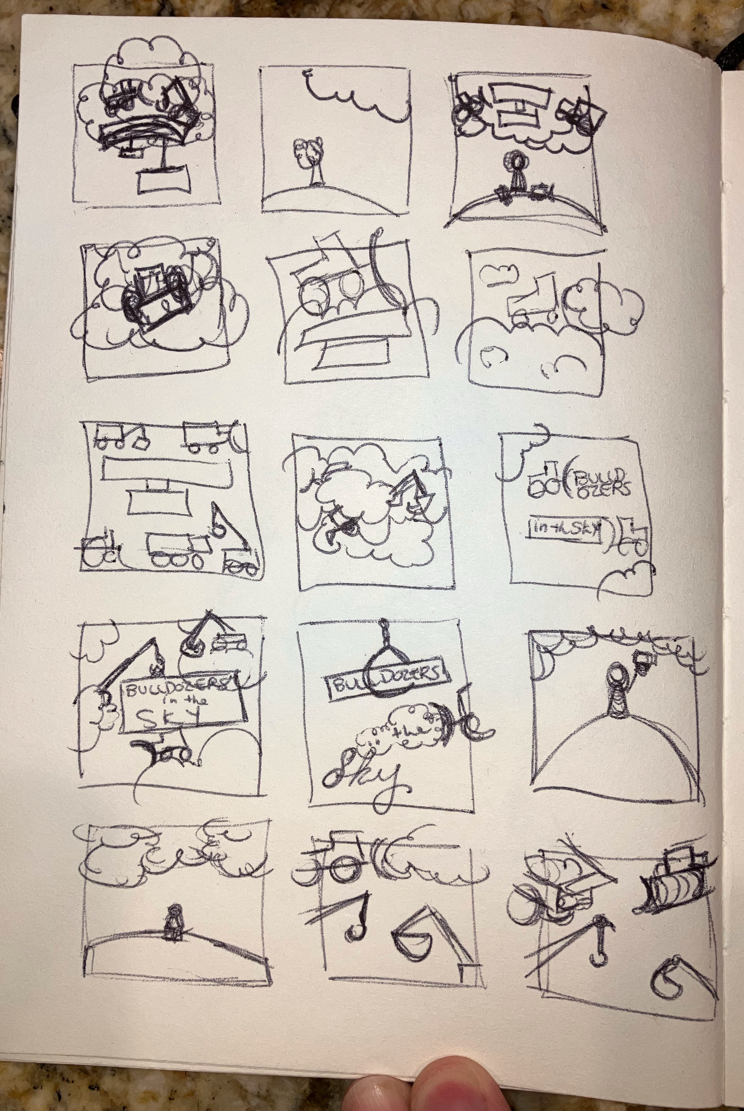
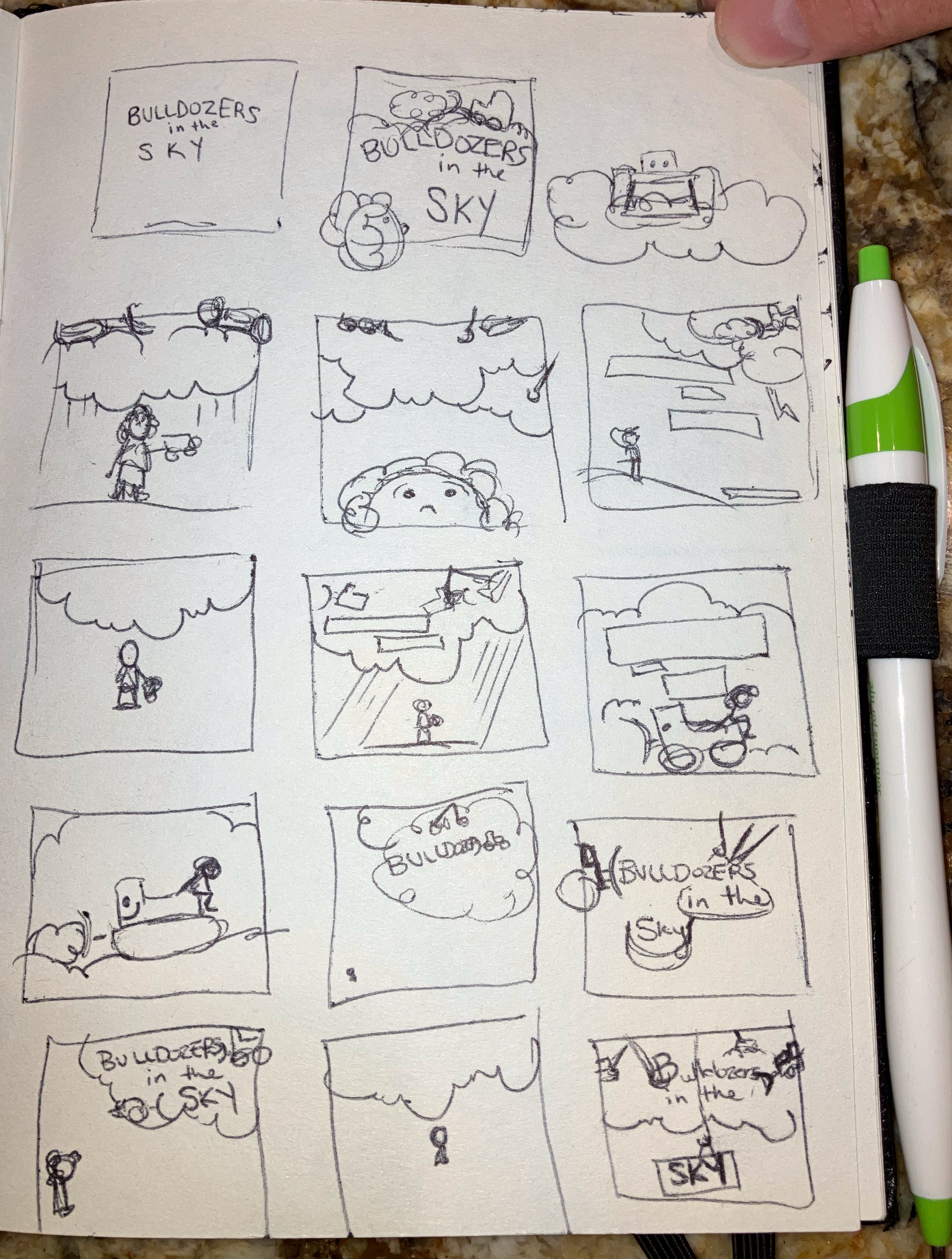
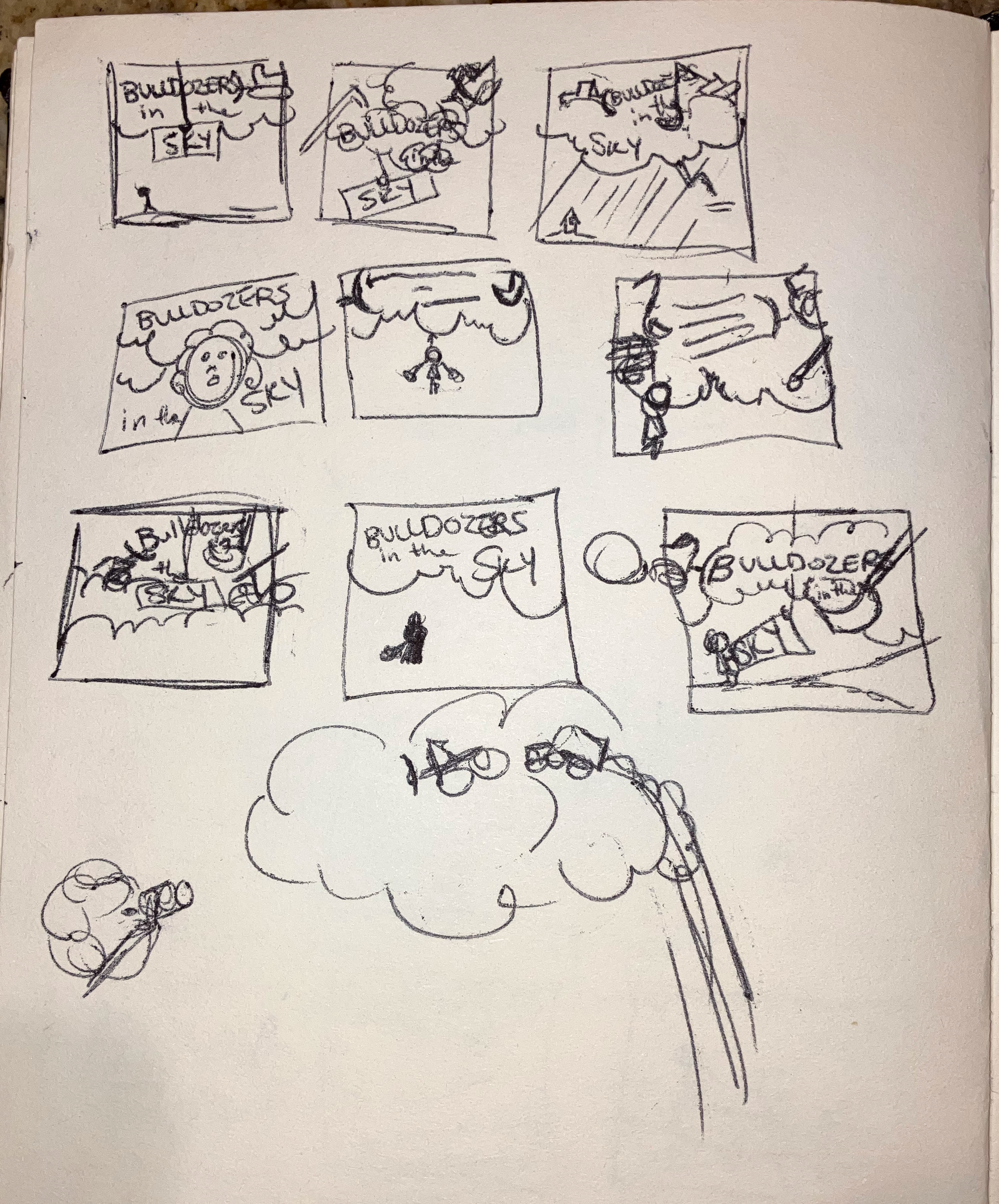
I experimented with different ideas—showing just the trucks, just Axel, or a combination of both. I played around with the idea of featuring only the trucks and leaving the boy off, but ultimately, I felt Axel needed to be there, front and center.
Sketches
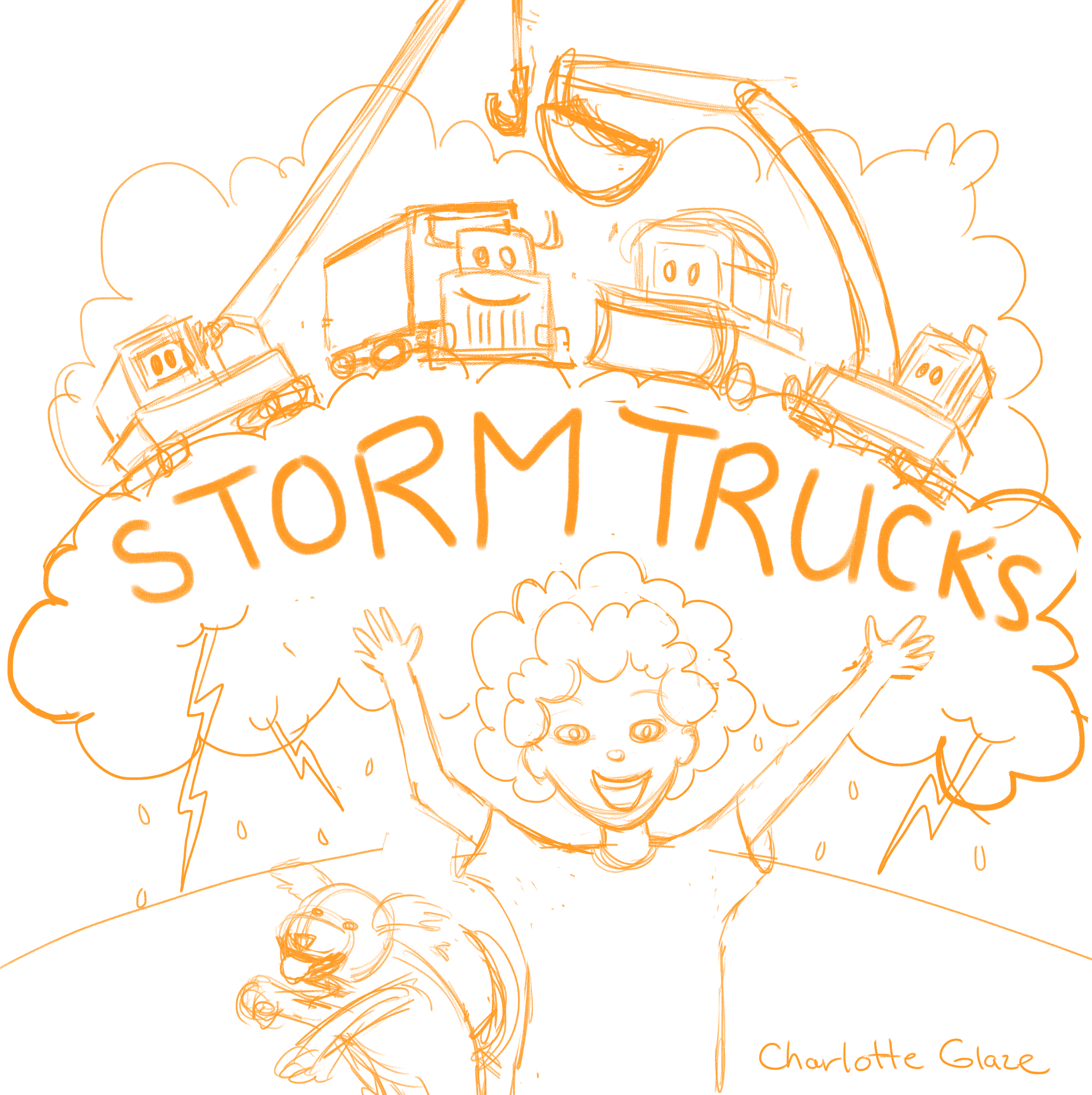
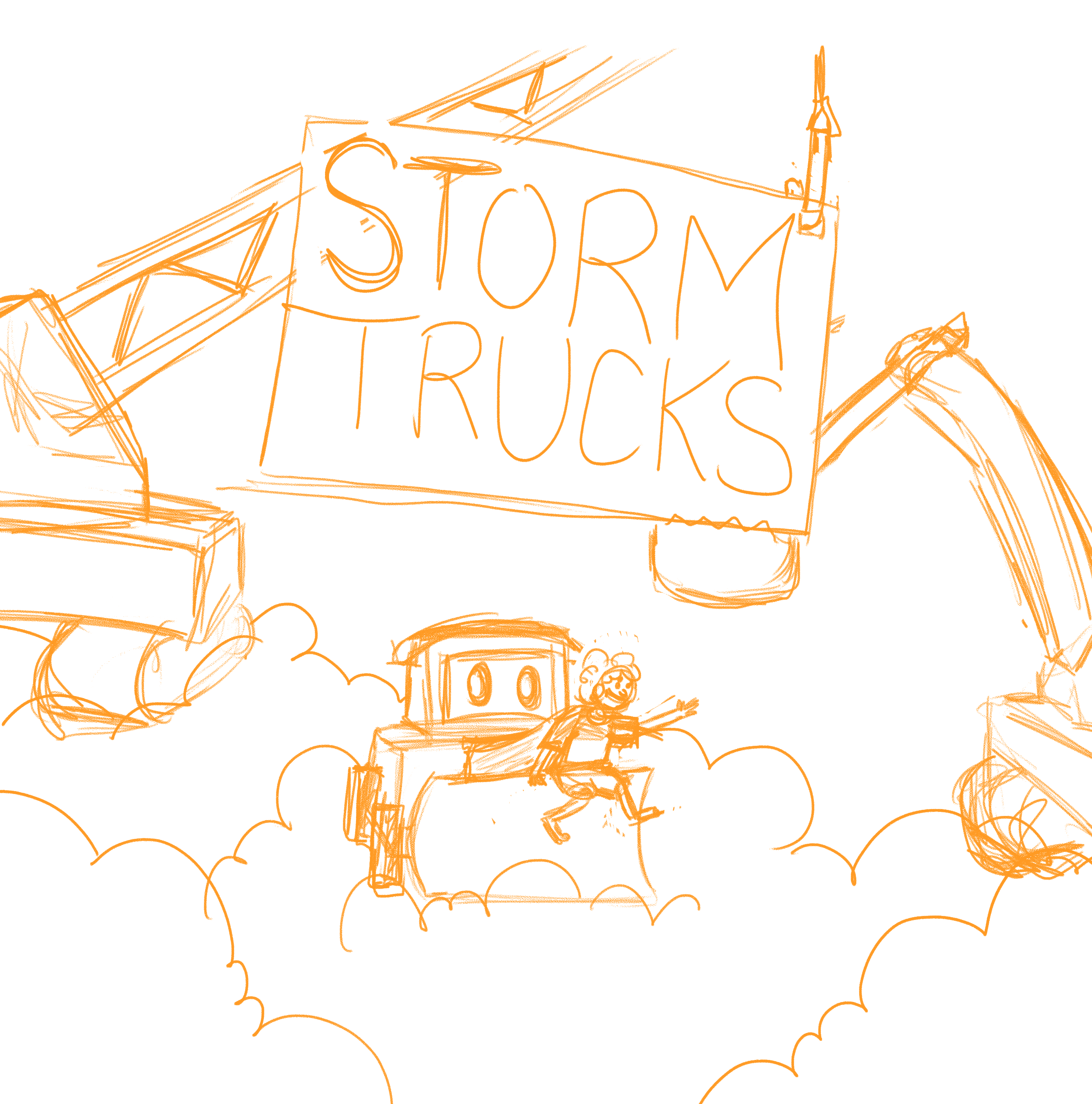
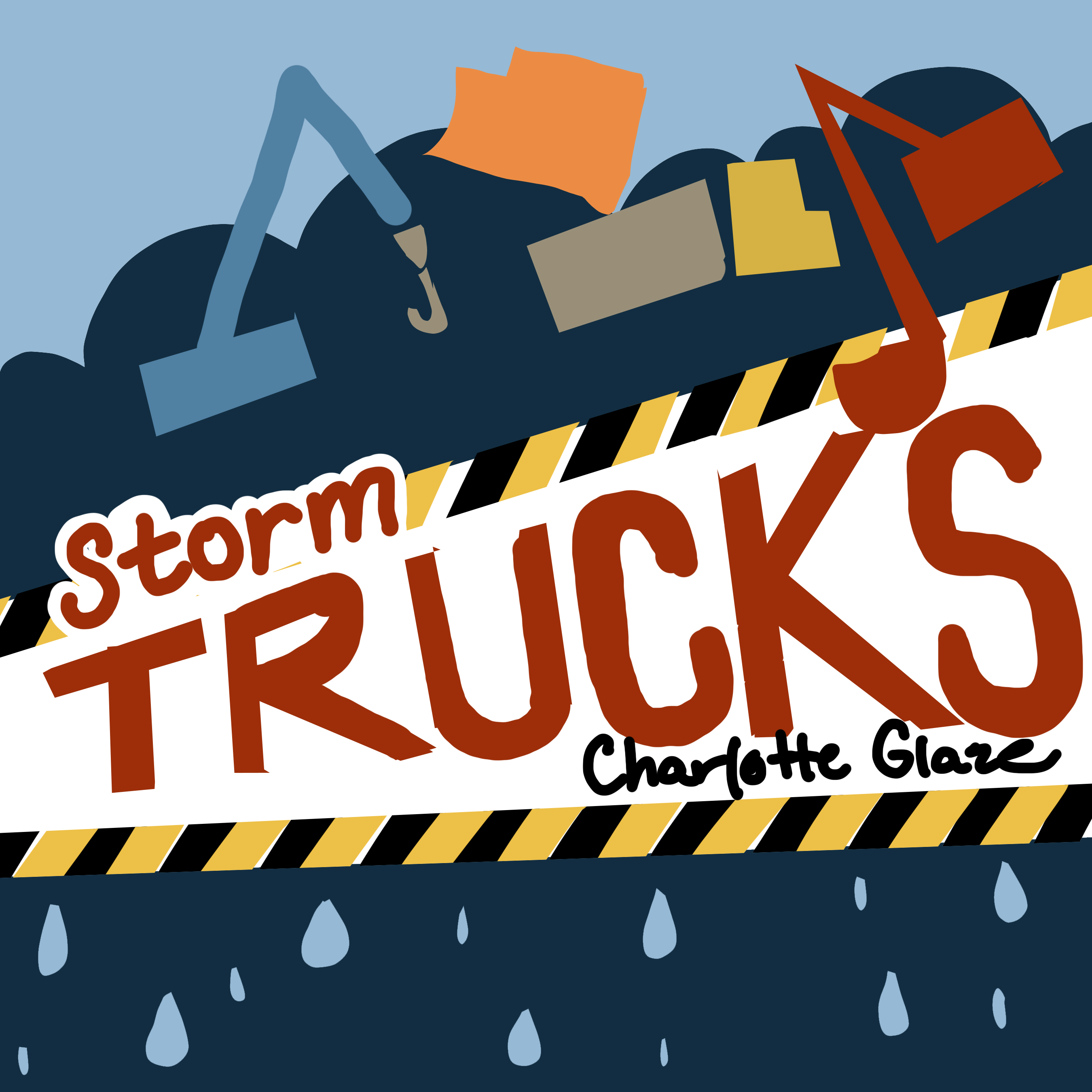
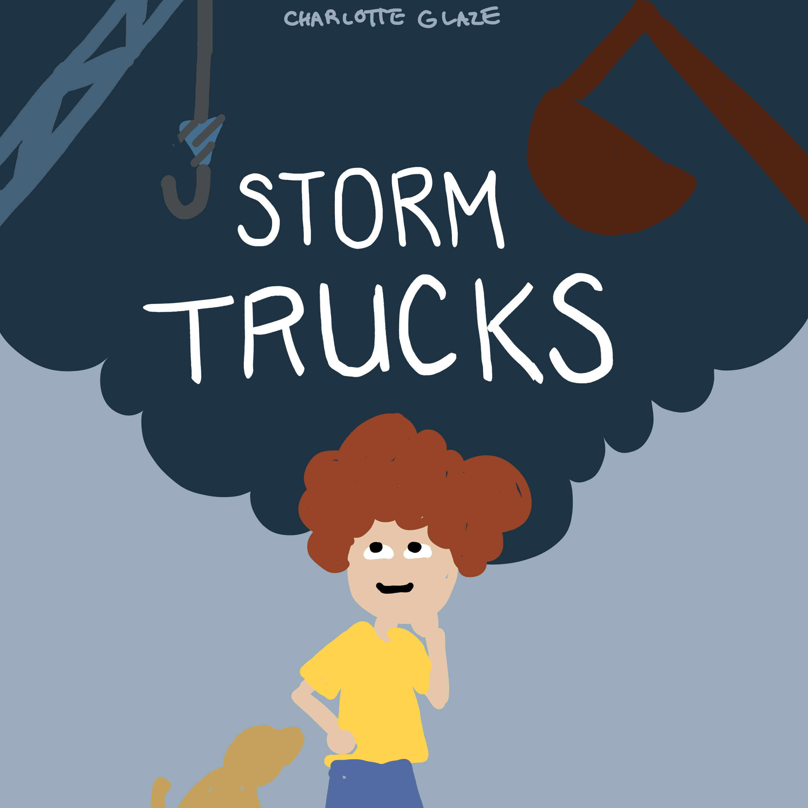
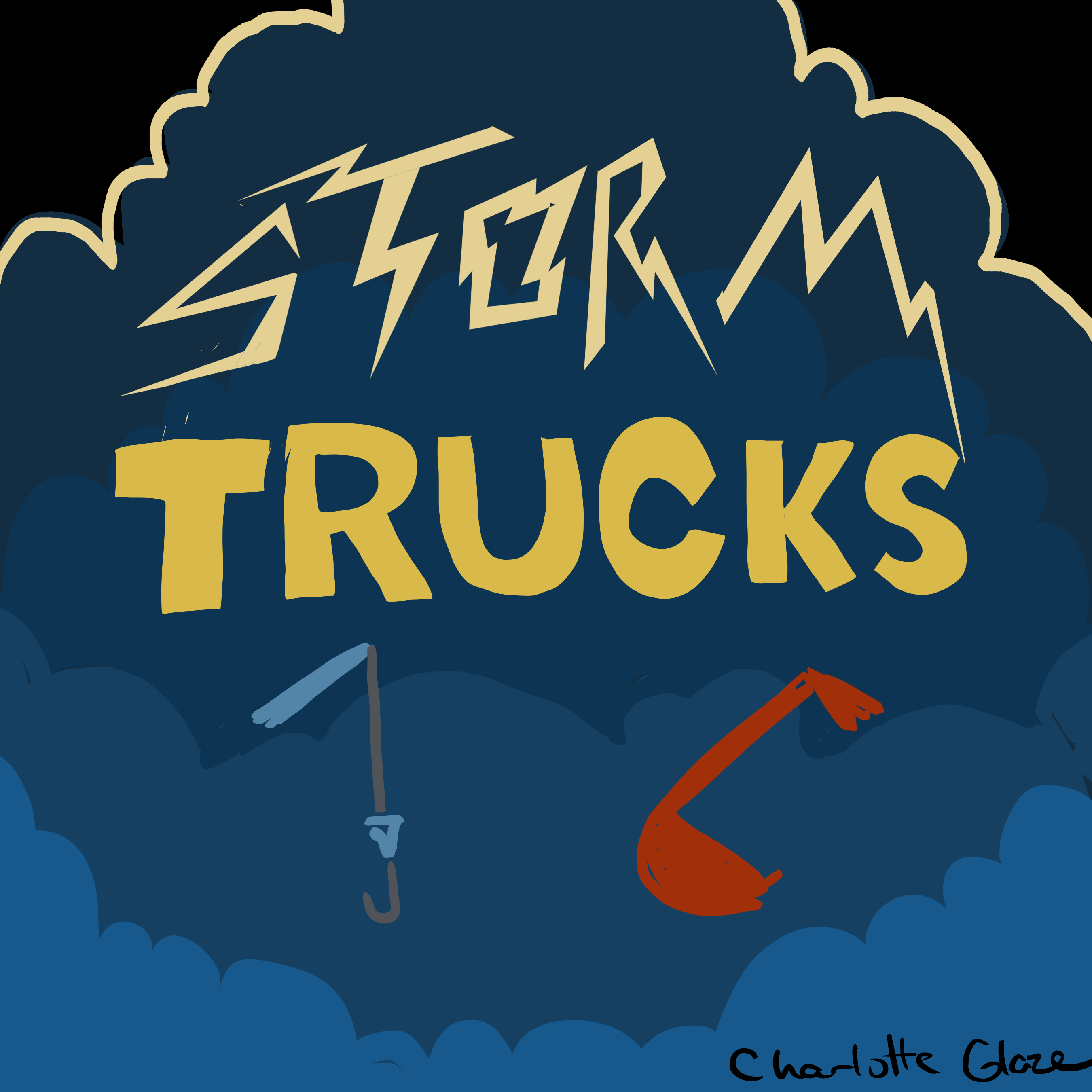
Once I had my favorite thumbnails, I moved on to larger sketches. Here’s a look at a few of the designs I thought were promising. Some of these I even added a bit of color to, just to get a sense of how they might feel as a finished cover. I also shared them with a few trusted friends and got some helpful feedback (because let’s be real, after staring at the same design for hours, you can start to lose perspective!).
Final Edits
After choosing the final design, I played around with colors and composition until it felt just right. I adjusted the placement of Axel and his little puppy, tried different fonts, and even tweaked the cloud colors a few times to make everything pop a little more. In the end, I was happy with how it all came together—the cover is bold, easy to read, and really gives you a sense of what the book is all about: storms, trucks, and one adorable little boy.
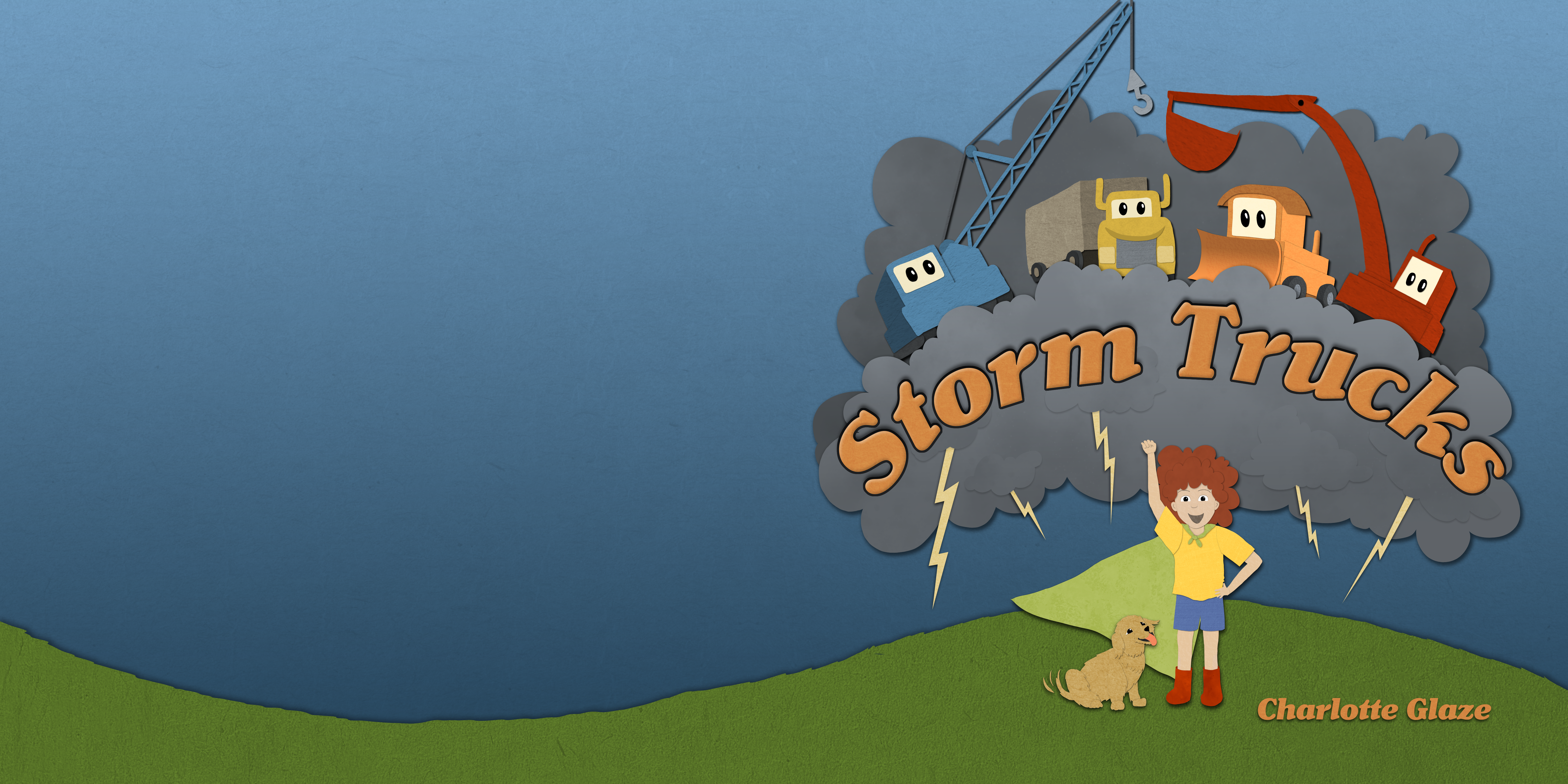
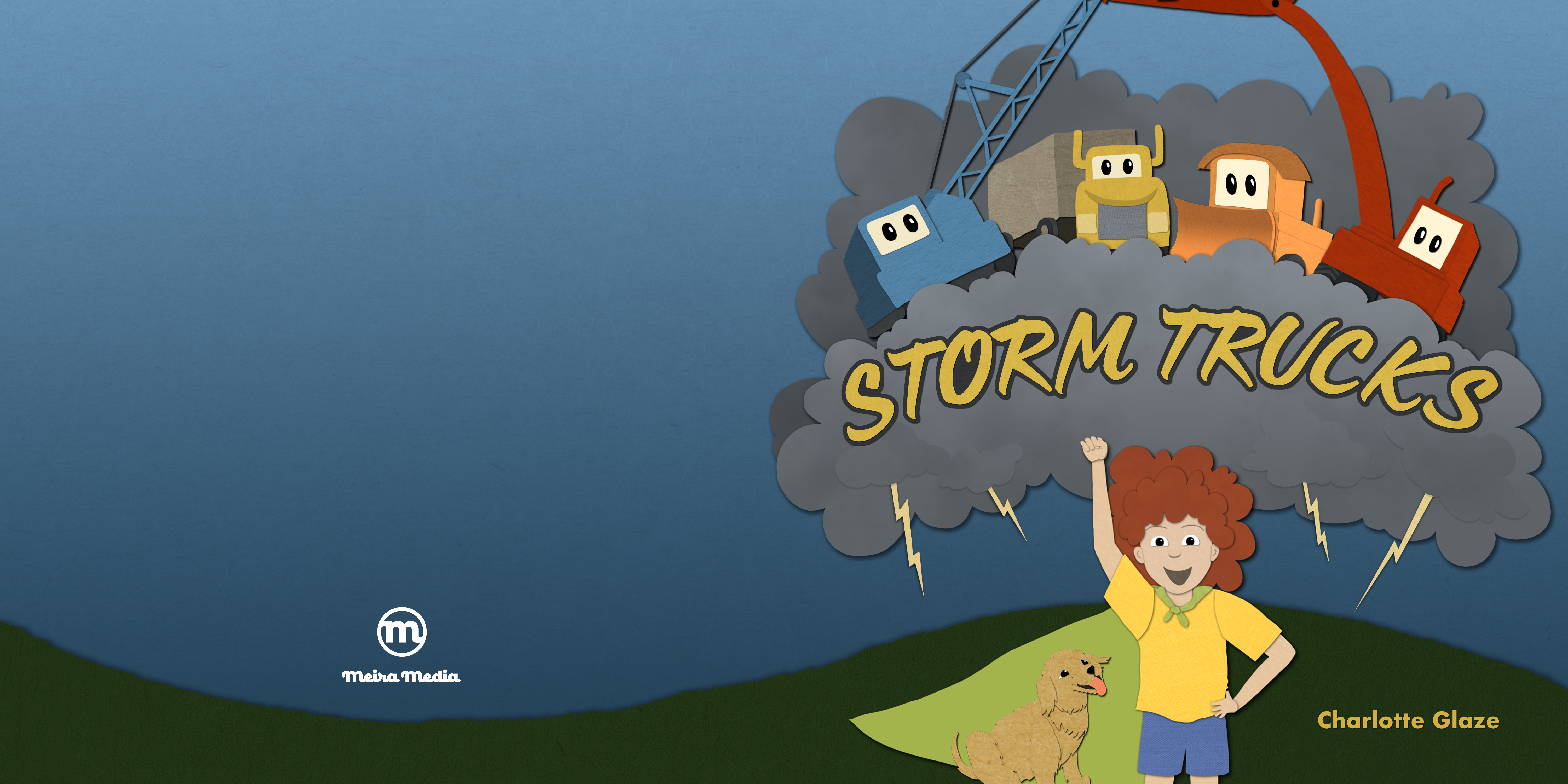

What do you think of my final design?
If you have any questions about designing a cover, pop them in the comments below. I’d love to hear your thoughts! And if you found this post helpful, be sure to subscribe to stay up to date on all things picture books and self-publishing.


0 Comments